![]()
![]()
![]()
![]()
![]()
![]()
![]()
|
|
|
|
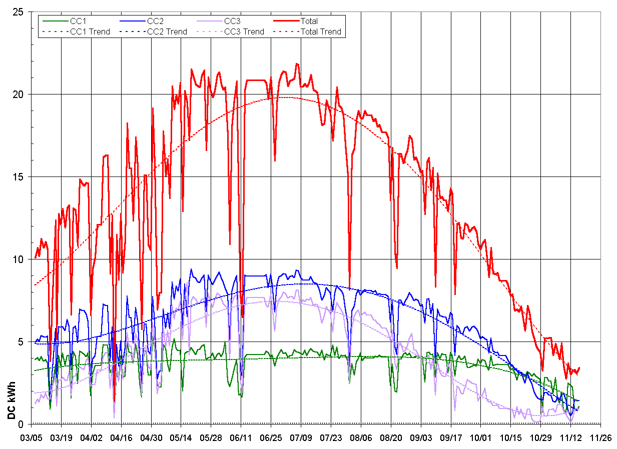
Since the system was installed in March, we have been taking daily readings for the amount purchased/sold to PG&E and the amount produced by the array. The array is broken into three charge controllers that accumulate the Amp-hours that they send to the DC bus. Multiplying this by the inverter's sell voltage and we can get the amount of DC power delivered to the DC bus each day. The amount of DC power from each charge controller (and the total) is graphed below. Click on the chart to zoom in.
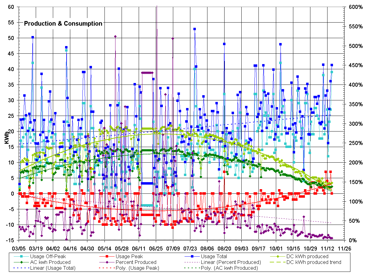
As you can see, the power output of the controllers (green, blue & purple curves) and of the total system (the red curves) vary quite a bit depending on the angle of the sun and the length of the day. As a matter of fact, charge controller #3 (the purple curve) gets a good bit of shading, so its output drops faster than controller #2. Controller #1 gets mainly morning sun and so it never really shows it full potential during the summer. EcoEnergies is the company who installed the PV system, and when they looked at the data and reviewed the solar pathfinder locations from the site survey, they decided that they needed to move some of the panels around. I'll update the web site when the actually do come and move the panels on the roof... This very confusing chart shows way too much information. It shows the DC and AC Produced and consumed, and on the right axis shows the efficiency of the system as far as providing all of our power for that day. If you are interested, click on the chart to zoom in and see it full size.
In order to calculate the amount consumed from the readings on the meter, which are net of consumption and production, we need to add the amount produced. So the PG&E meter shows the power that came in and went out and the charge controllers show the power that came in from the sun. As an example, if the sun gave us 7 kWh, and we bought 6 kWh off-peak and sold 3 kWh peak, our total consumption was 10 kWh. The sun, in this example, gave us 70% of what we consumed.
|
|
[Overstreet Web]
|